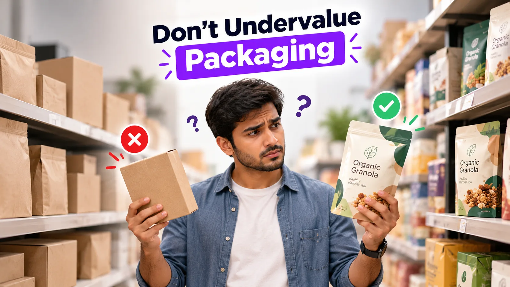
Packaging is often the very first physical interaction a customer has with your brand — before they’ve tried the product, before they’ve read a review, before they know anything about your company. When packaging looks cheap, thin, or careless, customers subconsciously assume the product inside is cheap too, even if it isn’t. That first impression directly affects whether they buy, whether they trust the brand, and whether they come back. Investing in proper packaging design isn’t a cosmetic expense — it’s a sales tool that works every time your product sits on a shelf or arrives at someone’s door.
Put Yourself in the Customer’s Shoes
Think about your own shopping habits for a second. When you’re buying from a brand you already know and trust, packaging barely matters — you already believe in the product. But now picture yourself standing in front of a shelf full of brands you’ve never heard of, or scrolling through new brands online. What do you actually judge them on in that first three seconds?
The color. The finish. How the label sits on the container. Whether the box feels sturdy in a product photo. Whether the design looks intentional or like it was thrown together. You’re not reading reviews yet — you’re reading the packaging. And so is every other new customer discovering a brand for the first time.
This is the exact moment where cheap packaging quietly costs a sale, whether the product itself deserved it or not.
What “Cheap” Packaging Actually Signals to Buyers
New and unfamiliar brands are judged almost entirely by presentation, because presentation is all a first-time customer has to go on. Poor packaging — flimsy materials, low-quality printing, mismatched colors, cluttered layouts — sends signals that have nothing to do with what’s actually inside the product:
- “This might not be a serious business.” Weak design makes even a great product feel like a side hustle rather than a brand worth trusting.
- “This might not be safe or high quality.” Especially in categories like food, skincare, and supplements, customers link visual polish directly to perceived safety and quality.
- “This isn’t worth the price.” Packaging that looks cheaper than the price tag creates doubt at the exact moment someone is deciding to buy.
None of this may be true about the product. But packaging isn’t neutral — it’s constantly making an argument to the customer, whether you designed it carefully or not.
The Real Cost: It’s Not Just One Lost Sale
Here’s the part that’s easy to underestimate. A single missed sale from bad packaging is a small loss. The bigger cost is what doesn’t happen afterward.
If a product looks good and a customer decides to try it, and the experience holds up, that’s how repeat customers and word-of-mouth start. Good packaging doesn’t just win the first purchase — it sets the tone for whether someone comes back, recommends it to someone else, or posts about it. Cheap packaging breaks that chain before it even starts, because it stops people from trying the product in the first place.
Your product speaks for itself once someone owns it. But packaging is what does the talking before that — when you’re not in the room to make the case yourself.
[Suggested image: side-by-side comparison of a cluttered, low-quality package vs. a clean, well-designed package of a similar product]
What Actually Goes Into Good Packaging Design
Good packaging isn’t about spending the most money — it’s about getting a few fundamentals right, consistently.
Material Selection
The material a customer touches communicates quality before they read a single word. A flimsy box or a thin, easily-crushed pouch undercuts even a well-designed label. Material choice should match both the product’s positioning (premium, everyday, eco-conscious) and its practical needs (protection, shelf life, shipping durability).
Printing Type & Finish
Matte, gloss, spot UV, embossing, foil — the finish you choose changes how a design feels in someone’s hands, not just how it looks in a photo. A premium product with a flat, low-resolution print job will always feel like a mismatch. The printing method should reinforce the story the design is already telling.
Color Psychology in Packaging
Color is doing more work on your packaging than almost anything else — it affects shelf visibility, perceived flavor or scent, and even trust. Choosing colors isn’t a matter of personal preference; it follows patterns specific to your industry and audience. (We go deeper into how to choose the right palette for your product in our dedicated post on color psychology in packaging — link here.)
Clear Product Photography & Information
If your packaging includes product photos, they need to be sharp, well-lit, and honest about what’s inside. Blurry or overly edited photos create doubt. Customers should never have to guess what they’re buying.
Instructions & Details That Build Trust
Ingredients, usage instructions, certifications, and care details all matter more than most brands think. Clear, well-organized information signals that a business has nothing to hide and has thought the product through — while missing or confusing details raise quiet red flags, even for products that are perfectly safe and well-made.
How We Approach Packaging Design
Every project we take on follows the same core practice: we don’t treat packaging as a one-time design task, we treat it as a product’s silent sales pitch. That means we look at material, print method, layout, and color together — not in isolation — so the finished packaging holds up under real-world conditions: on a shelf, in a delivery box, in a customer’s hands.
We also build in room for testing and revisions before final production, because a packaging mistake caught on-screen is a lot cheaper to fix than one already printed on a few thousand units.
Industry Examples
Packaging expectations shift a lot depending on the category. A couple of examples:
Food & Beverage
In food packaging, color and clarity directly affect perceived taste and freshness before anyone opens the product. Ingredient visibility, expiry information, and food-safe printing aren’t optional — they’re often the first thing a cautious buyer checks. (We’ve written a dedicated, deeper post specifically on food packaging design — link here once published.)
[Other Industry — e.g. Skincare, Supplements, Retail Goods]
Different categories carry different trust signals — certifications, ingredient transparency, or premium finishing, depending on what customers expect from that space. (We’ll be publishing an industry-specific breakdown for this category too — link here once published.)
[Suggested image: two or three packaging mockups across different industries, shown side by side]
Tips & Tricks for Choosing Better Packaging
- Don’t judge your packaging in isolation — compare it directly next to 2–3 competitor products before finalizing
- Hold a physical sample before approving a print run; screens make everything look better than it feels in hand
- Match your packaging tier to your price point — packaging that looks cheaper than your price creates doubt
- Keep your front-facing design simple; cluttered packaging is one of the fastest ways to lose a customer’s attention on a shelf
- Get a second opinion from someone outside your business — you’re too familiar with the product to see it the way a first-time customer does
- Test packaging with real customers before a full production run, not just internally
FAQs
Is expensive packaging always better than cheap packaging?
Not necessarily — the goal isn’t to spend the most, it’s to match your packaging to your price point and audience expectations. Overspending on packaging for a budget product can feel just as mismatched as underspending on a premium one.
How much of my budget should go toward packaging design?
This varies by industry and product, but packaging should be treated as a core marketing cost, not an afterthought — it’s often doing more to influence a first purchase than a paid ad ever will.
Can I redesign packaging without confusing existing customers?
Yes, with a gradual approach — keeping core brand colors and logo placement consistent while updating materials or finishes reduces the risk of existing customers not recognizing the product.
How do I know if my packaging is actually hurting sales, and not something else?
Compare your packaging directly against 2–3 close competitors, and ask people unfamiliar with your brand what they assume about the product from the packaging alone. If the answers don’t match how you actually price or position the product, packaging is likely part of the problem.
Conclusion
Packaging isn’t decoration — it’s the first conversation your product has with a customer, and it happens before you’re in the room to make your case yourself. Cheap, careless packaging doesn’t just look bad; it actively costs sales, trust, and repeat customers, often without a business ever realizing why. The good news is that fixing it doesn’t require a massive budget — it requires the right materials, the right print approach, the right colors, and design decisions made with the customer’s first impression in mind, not just internal preference.
If you’re not sure whether your current packaging is helping or quietly working against you, that’s exactly the kind of thing worth a second look before your next production run.
Want a second opinion on your packaging before you print? Contact us — we help brands design packaging that earns trust the moment someone picks it up.