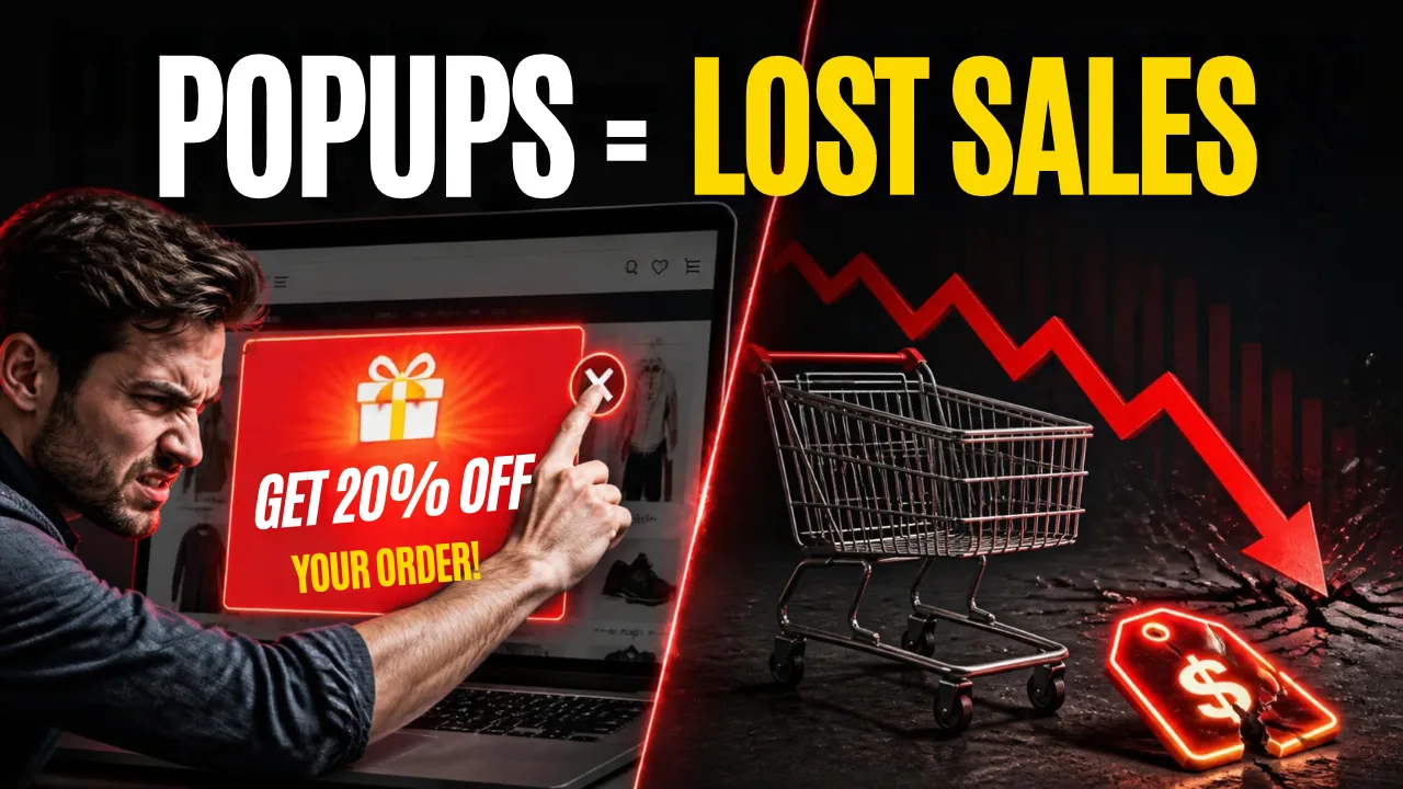
If your website still blasts a discount popup the second someone lands on it, this one’s worth 3 minutes of your time. Most stores don’t realize the exact thing they added to boost sales is quietly pushing buyers away, hurting how Google ranks the page, and making the brand look cheaper than it actually is. Fix the placement, and you keep the discount and the trust.
The Quick Answer
Stop blocking the screen. Move the discount to a banner, sidebar, or spot near the product price instead of a popup that covers the whole page. Same offer, same urgency — just placed where the visitor can see it without being interrupted. That’s the whole fix. Below is the why and how.
Why This Is Costing You Sales Right Now
You land on a site. Before you’ve scrolled once, a giant popup slams across your screen: “10% OFF — SUBSCRIBE NOW!”
You didn’t ask for it. You don’t trust it yet — you haven’t even seen the product. So you close it. Sometimes you close the whole tab with it.
Industry data backs this up. 70–90% of visitors close a popup without taking any action at all. And generic popups — the same message shown to every visitor, no matter what they’re looking at — convert 20–40% worse than offers that actually match what the person came for.
That’s not a small gap. That’s real revenue, walking out the door, every single day your site does this.
Why Generic Popups Feel Cheap
Think about the last premium brand site you visited — Apple, a high-end fashion label, a well-built SaaS product.
Did any of them block your screen with a flashing discount the moment you arrived?
Almost never.
Premium brands don’t need to force an offer on you. The product does the talking. The offer sits quietly where you’ll find it — if you’re interested.
That’s the real lesson here:
- A popup that interrupts you feels like a business that’s desperate for the sale.
- A banner that informs you feels like a business that’s confident in what it’s selling.
Simple Example
A shopper searches “best gold necklace under $500,” clicks your product page from Google, and gets hit with a full-screen popup before reading a single word.
On mobile, that’s not just annoying — Google can actually penalize the page for it. One popup, two problems: a lost visitor and a lower ranking.
How It Hurts You — Beyond Just “Annoying”
This isn’t only a feeling. It’s measurable.
H3: Timing Kills Conversions
Popups that fire the instant a page loads perform the worst. The visitor hasn’t seen anything worth reacting to yet, so it feels random — and gets closed on reflex.
H3: Google Penalizes Intrusive Mobile Popups
If your popup covers the main content on mobile before someone can even read the page, it can trigger Google’s mobile interstitial penalty. That’s a direct ranking hit, not just a UX complaint.
H3: Layout Shift Hurts Core Web Vitals
A popup that loads and shifts the page after it renders damages your Cumulative Layout Shift (CLS) score — one of the metrics Google uses to rank pages.
H3: AI Search Reads Clean Pages Better
More shopping traffic is now coming through AI search summaries and shopping agents. A page cluttered with a blocking popup is harder for these tools to read cleanly — and less likely to get recommended.
The Fix — Keep the Offer, Lose the Interruption
You don’t need to remove your discounts. You need to change where they live.
| Placement | Why It Works |
|---|---|
| Slim banner on the homepage | Seen by everyone, blocks nothing |
| Sidebar offer on category/blog pages | Present, but not demanding attention |
| Banner on the product page, near the price | Shown exactly when the visitor is deciding to buy |
| Dedicated offers/deals page | People who want a deal can go find it |
| Small strip near checkout | Reinforces the discount right at the decision point |
Simple Example by Category
Jewelry store: Instead of a popup showing “15% OFF ALL RINGS” the second someone lands, put that same message as a thin banner right under the product photo, next to the price. The shopper sees it exactly when they’re deciding whether to buy — not before they’ve even seen what they’re buying.
Solar / home services site: Instead of an interruption popup on the homepage, add a simple banner strip: “Limited-time rebate available this month” — placed above the contact form. It stays visible without blocking the information visitors actually came to read.
Tips & Tricks
- If you do use a popup, delay it. Let visitors scroll or spend a few seconds on the page first — delayed popups consistently outperform instant ones.
- Make the close button obvious. A tiny hidden “X” frustrates people more than the popup itself.
- Never repeat the same popup on every page. Match the offer to what the visitor is actually looking at.
- Test a banner against a popup for two weeks. Compare actual sales, not just popup clicks — banners often win on trust even if the raw click number looks lower.
- Keep mobile in mind first. Most traffic is mobile, and that’s where Google’s penalty and user frustration both hit hardest.
FAQs
Does removing popups mean losing conversions from discounts?
No — it means moving the same discount to a spot where it still gets seen but doesn’t interrupt the browsing experience. Many stores see steadier engagement once the offer feels like part of the site rather than an ambush.
Are exit-intent popups the same problem?
They’re less harmful because they trigger only when someone is already leaving, but they can still feel aggressive if shown on every page regardless of what the visitor was actually looking at.
Do popups really affect SEO?
Yes. Google has openly penalized intrusive mobile interstitials, and popups that shift page layout after load hurt Core Web Vitals scores directly.
What’s a good middle ground for stores that still want strong offer visibility?
A homepage banner plus a product-page banner near pricing tends to cover both discovery and decision-making moments — without ever blocking the screen.
Conclusion
A discount is a tool, not the personality of your brand. Block the whole screen with it, and the store looks pushy. Place it quietly on a banner near the price, and the same offer still gets seen — without costing you trust, ranking, or the sale.
Simple example to remember: two stores sell the same necklace at the same discount. One blocks the screen with a popup. The other shows a small banner next to the price. The second one looks more premium — and still gives the buyer the same deal.