The Challenge
The client wanted a logo that felt clean, recognizable, and professional, while still connecting naturally with the septic and drain services they provide.
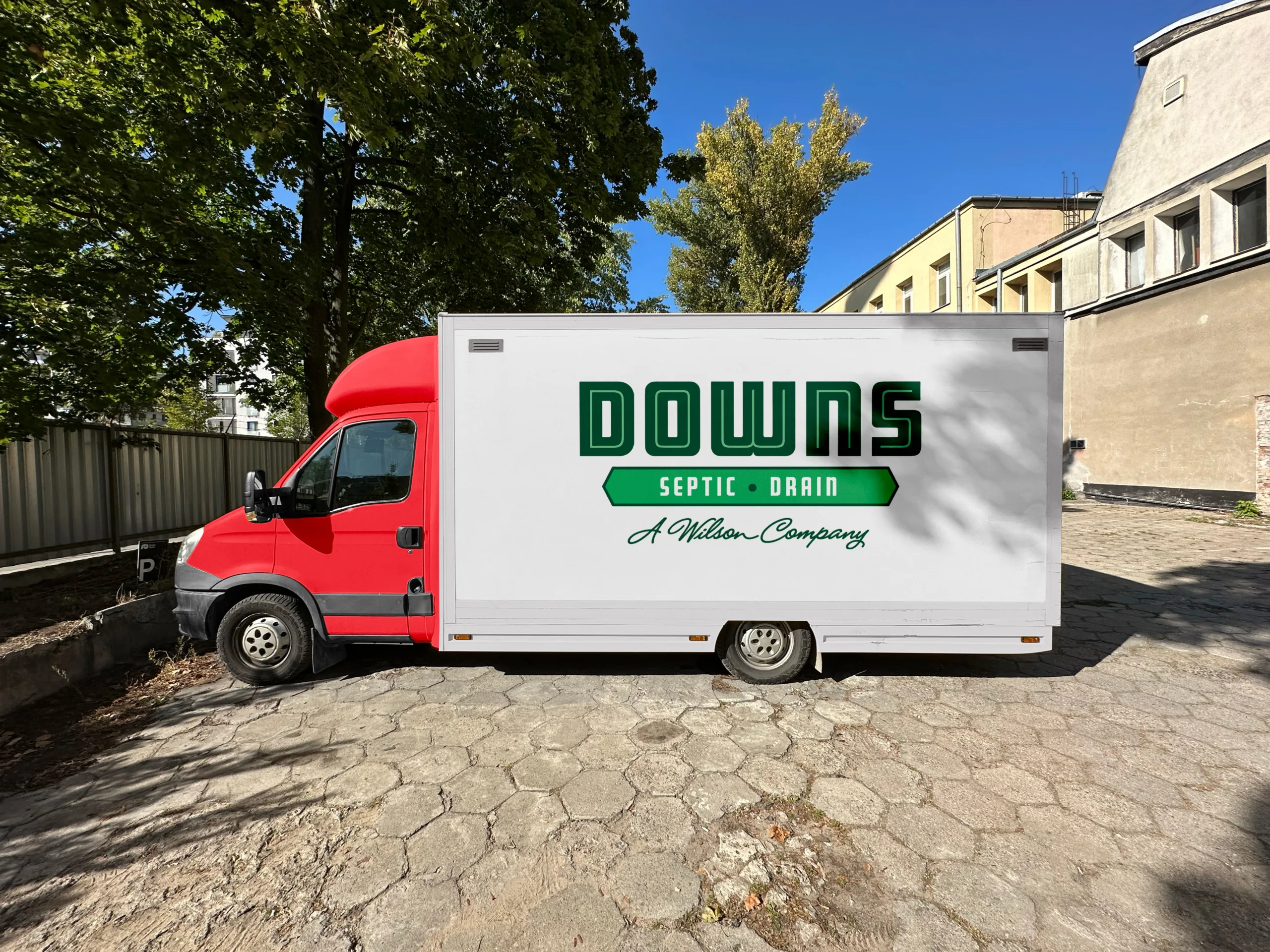
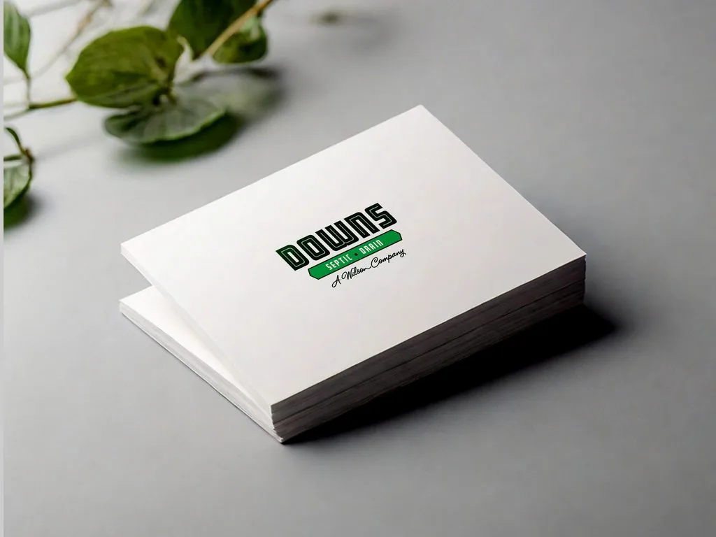
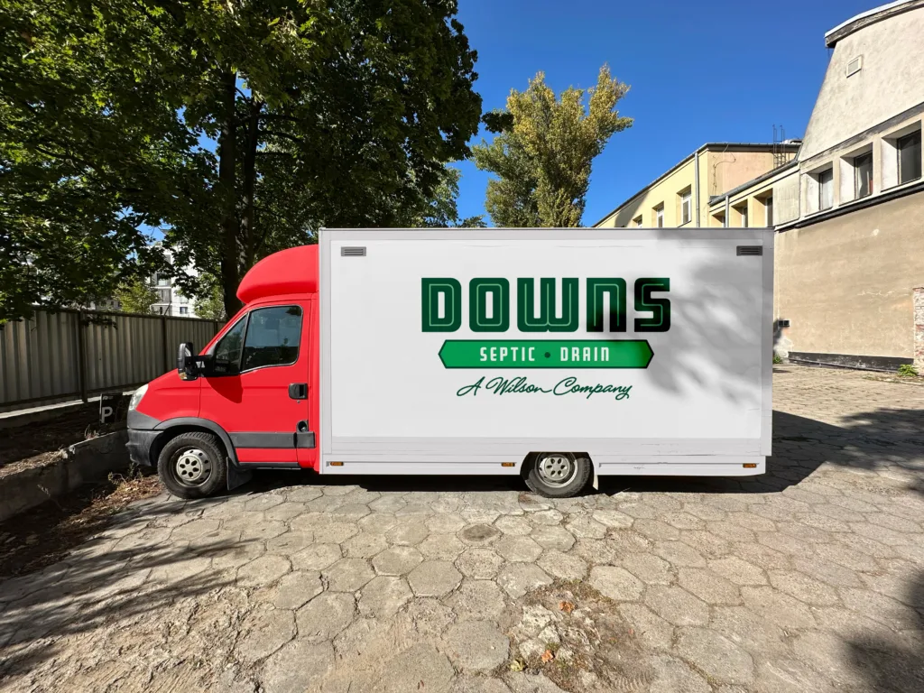
The identity needed to work across different applications — from vehicles and uniforms to websites, signage, and printed materials.
Our Approach
We developed the identity around the company’s name and industry, using a bold, practical visual style with a green color palette that creates a connection with nature, water, and outdoor environments.
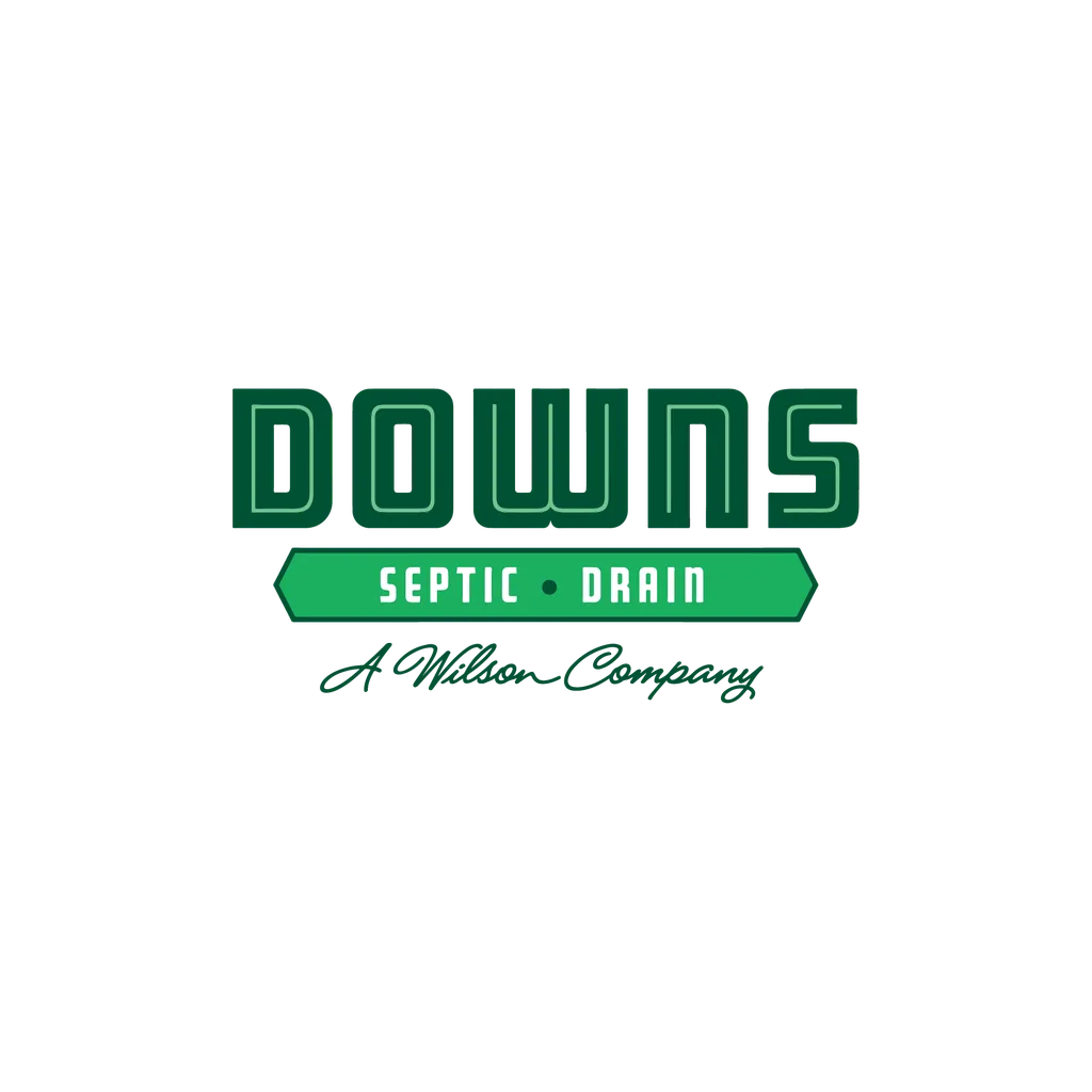
The typography was designed to give the brand a strong presence, while the supporting “SEPTIC • DRAIN” element clearly communicates what the company does.
The Result
The final logo combines:
- Bold custom-styled typography for strong recognition
- Green tones to reinforce the connection with nature and environmental services
- SEPTIC • DRAIN descriptor for immediate industry recognition
- A clean, scalable structure suitable for both digital and physical applications
- A distinctive “A Wilson Company” endorsement that can remain part of the identity system
The result is a straightforward identity designed to remain recognizable across different brand touchpoints.